A booking application, a field service tool, a clinic, a production plan: each
shows time on one axis and people or work on the other, and lets the user move
things around in it. Two components cover that ground. Scheduler shows items
in time by the day, the week, the month, as an agenda, or against a list of
resources. Gantt shows a project: tasks in a tree, the bars they take up on a
time axis, the links between them and the load they put on the people who do
them.
Both are in com.codename1.ui.scheduler, and both draw from a model in
com.codename1.scheduling that has no user interface in it. The model is plain
Java you can build, test and store without a form on screen.
Both components paint their content directly instead of building a component for each item. A month with thousands of items scrolls the way one with ten does, the hour column and the row titles stay in view while the rest moves under them, and a pinch or a control-wheel zooms the time axis.
A first schedule
A ScheduleItem has an id, a title, a start and an end. Instants are epoch
milliseconds; TimeMath turns a day and a minute of the day into one in a time
zone, so a day that’s 23 or 25 hours long comes out right.
ZoneId zone = ZoneId.systemDefault();
long today = TimeMath.epochDay(System.currentTimeMillis(), zone);

DefaultScheduleModel model = new DefaultScheduleModel();
model.addItem(new ScheduleItem("standup", "Stand-up",
        TimeMath.at(today, 9 * 60, zone), TimeMath.at(today, 9 * 60 + 30, zone)));
model.addItem(new ScheduleItem("review", "Design review",
        TimeMath.at(today, 13 * 60, zone), TimeMath.at(today, 14 * 60 + 30, zone))
        .setDetail("Room 2"));
model.addItem(new ScheduleItem("offsite", "Offsite",
        TimeMath.startOfEpochDay(today + 1, zone), TimeMath.startOfEpochDay(today + 2, zone))
        .setAllDay(true));

Scheduler scheduler = new Scheduler(model);
scheduler.setView(Scheduler.View.WEEK);

Form form = new Form("Schedule", new BorderLayout());
form.add(BorderLayout.CENTER, scheduler);
form.show();
Give the scheduler the center of a BorderLayout. It scrolls inside the room
it’s given, so it doesn’t belong in a container that scrolls too.
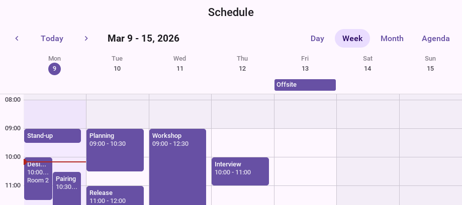
The toolbar above the grid moves to the previous or the next stretch, returns
to today and switches between views. setViews chooses which views it offers,
setToolbarVisible(false) removes it when the application has a heading of its
own, and next(), previous(), today() and setDate() do from code what
its buttons do.
| View | What it shows |
|---|---|
| Hours down the page, a column for each day. Items that overlap share the column’s width, and items that last all day sit in a lane above the hours. |
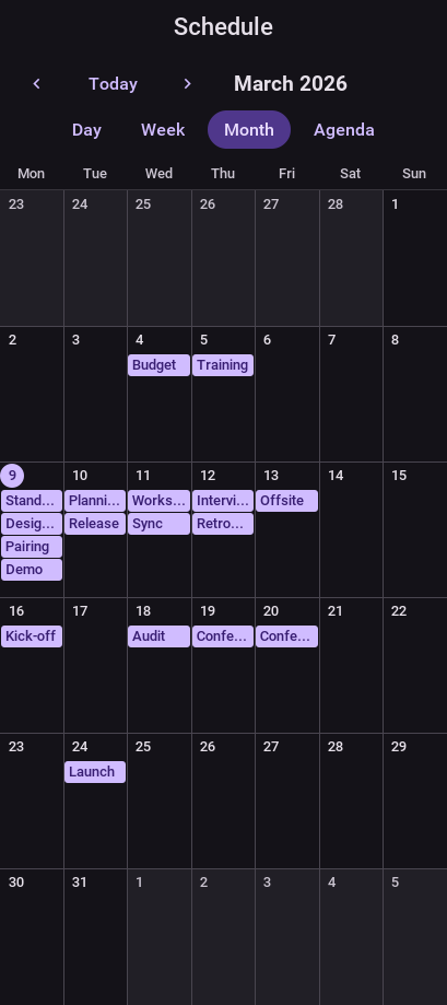
| A grid of days with the first items of each, and a count of the rest. |
| A list of the coming days and what’s in them. |
| One day, with a column for each resource: who’s free at ten. |
| A row for each resource and time running across: who’s booked this week. |
WORK_WEEK shows the days the scheduler’s WorkCalendar works. A week starts
on Monday unless setFirstDayOfWeek says otherwise, and a week that starts on
the day the user asked from is the same view with that day as its first.
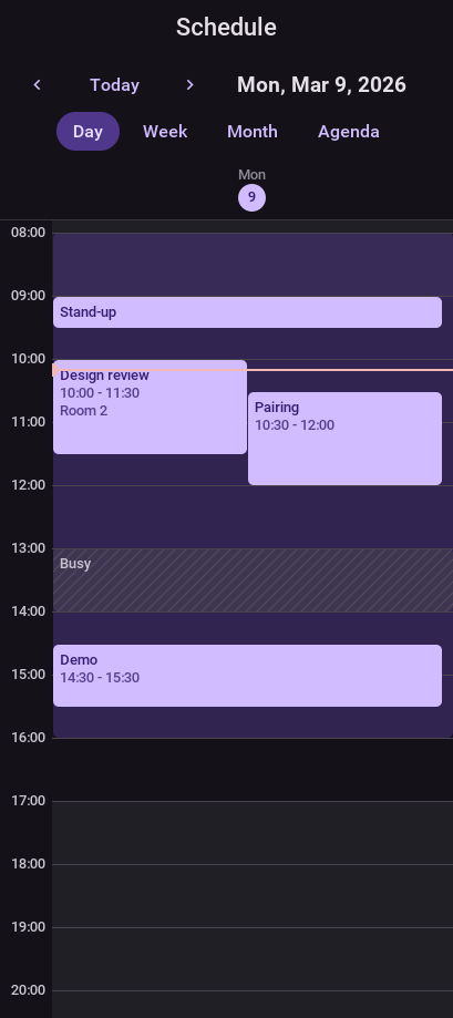
The bar over the schedule is one row where there is room for it. On a screen
as narrow as a phone’s the buttons that pick the view move to a row of their
own, as in the day view below, and setCompactToolbar(true) folds them into a
single button with a menu.
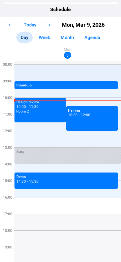
The figures that follow are one schedule, three people’s month, in each view.
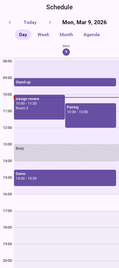
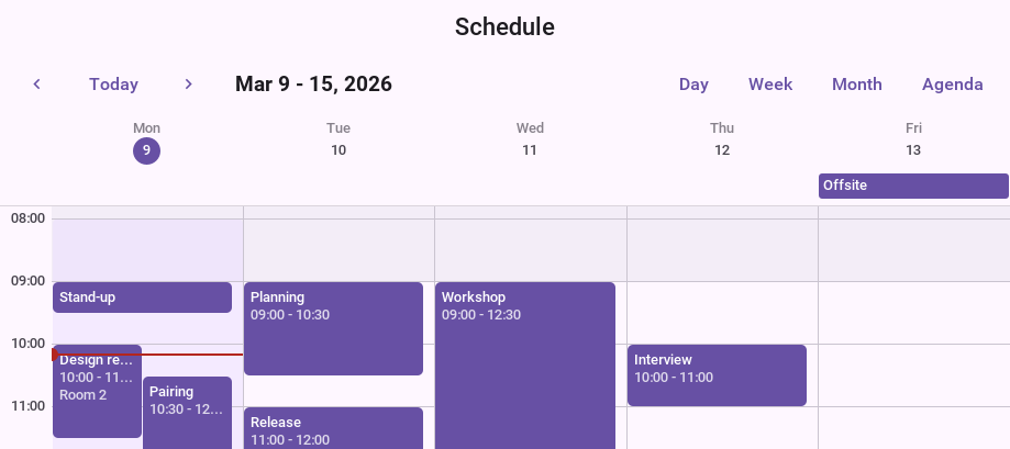
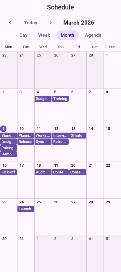
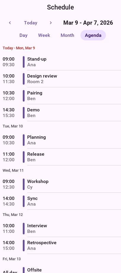
The views take their colors from the theme, so they follow its dark appearance and look at home on each platform with no code:
Resources
A ScheduleResource is anything work is booked against: a person, a room, a
machine. An item names its resource by id.
ZoneId zone = ZoneId.systemDefault();
long today = TimeMath.epochDay(System.currentTimeMillis(), zone);

DefaultScheduleModel model = new DefaultScheduleModel();
model.addResource(new ScheduleResource("ana", "Ana").setDetail("Stylist"));
model.addResource(new ScheduleResource("ben", "Ben").setDetail("Colourist"));

// The hours Ana works, drawn as a band under her bookings.
model.addItem(new ScheduleItem("ana-shift", "",
        TimeMath.at(today, 9 * 60, zone), TimeMath.at(today, 17 * 60, zone))
        .setResourceId("ana").setKind(ScheduleItem.Kind.BACKGROUND));
model.addItem(new ScheduleItem("cut", "Cut and finish",
        TimeMath.at(today, 10 * 60, zone), TimeMath.at(today, 11 * 60, zone))
        .setResourceId("ana"));
// Time taken by another calendar: hatched, and nobody's to move.
model.addItem(new ScheduleItem("dentist", "Busy",
        TimeMath.at(today, 12 * 60, zone), TimeMath.at(today, 13 * 60, zone))
        .setResourceId("ben").setKind(ScheduleItem.Kind.BLOCKED));

Scheduler scheduler = new Scheduler(model);
scheduler.setViews(Scheduler.View.RESOURCE_DAY, Scheduler.View.RESOURCE_TIMELINE);
scheduler.setView(Scheduler.View.RESOURCE_DAY);

Form form = new Form("Team", new BorderLayout());
form.add(BorderLayout.CENTER, scheduler);
form.show();
An item is one of three kinds. An EVENT is a block with a title that can be
selected, opened, and moved. A BACKGROUND item is a band under the events,
such as the hours somebody is available. A BLOCKED item is time that’s taken
and isn’t this application’s to edit, such as busy time read from another
calendar, and it’s drawn hatched so it never reads as an event that lost its
color.
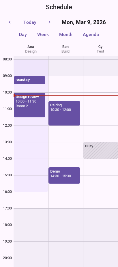
RESOURCE_DAY: a column for each person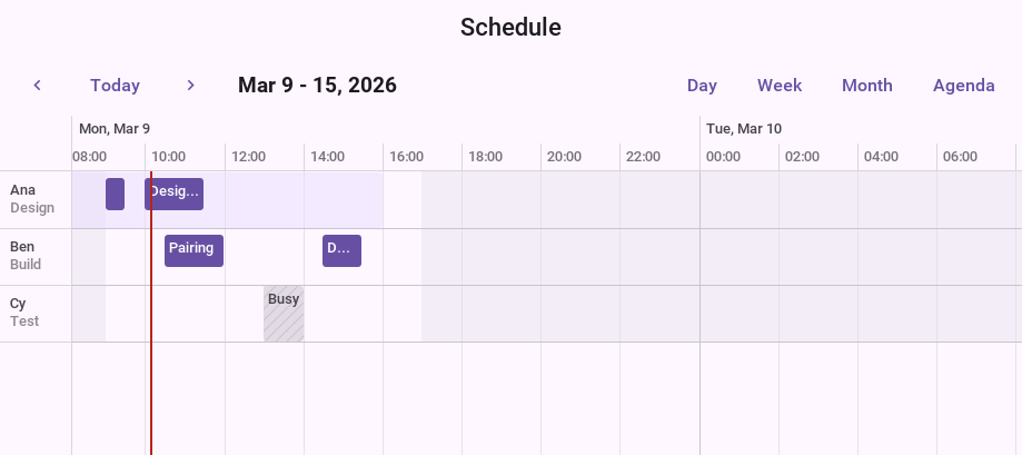
RESOURCE_TIMELINE: a row for each personWorking hours
A WorkCalendar says which days are worked and between which minutes of the
day, with exceptions for single dates. The scheduler shades the time outside
it, and a resource can carry a calendar of its own.
ZoneId zone = ZoneId.systemDefault();
WorkCalendar hours = new WorkCalendar(zone);
// 08:30 to 12:00 and 13:00 to 17:30, Monday to Friday.
hours.setWorkingHours(8 * 60 + 30, 12 * 60, 13 * 60, 17 * 60 + 30);
// Saturday mornings.
hours.setWorkingDay(6, true);
hours.setWorkingHours(6, new int[] {9 * 60, 13 * 60});
hours.addHoliday(TimeMath.epochDay(System.currentTimeMillis(), zone) + 3);

Scheduler scheduler = new Scheduler();
scheduler.setWorkCalendar(hours);
scheduler.setView(Scheduler.View.WORK_WEEK);

Form form = new Form("Working hours", new BorderLayout());
form.add(BorderLayout.CENTER, scheduler);
form.show();
WorkCalendar.continuous(zone) is a calendar with no time off at all, for a
schedule that draws its own availability as background items.
Selecting, opening and editing
With a mouse, a drag moves the item under it, a drag on an item’s edge resizes
it, and a drag across empty time selects a range. On a touch screen a drag
scrolls, and a long press starts the same edits. setDragEdits overrides the
choice, setEditable(false) makes the schedule read only, and an item can
refuse on its own with setMovable(false) or setResizable(false). Times snap
to setSnapMinutes.
A SchedulerListener hears about every one of them. itemChanging is asked before an
edit lands and can refuse it, which leaves the item where it was.
DefaultScheduleModel model = new DefaultScheduleModel();
// The application shows its own editor for a new item, so the model
// does not make one by itself.
model.setCreationEnabled(false);

Scheduler scheduler = new Scheduler(model);
scheduler.setSnapMinutes(15);
scheduler.addSchedulerListener(new SchedulerAdapter() {
    @Override
    public void itemOpened(Scheduler s, ScheduleItem item) {
        Dialog.show(item.getTitle(), s.formatRange(item.getStart(), item.getEnd()), "OK", null);
    }

    @Override
    public void rangeSelected(Scheduler s, long start, long end, String resourceId) {
        model.addItem(new ScheduleItem("new-" + start, "New booking", start, end)
                .setResourceId(resourceId));
        s.refresh();
    }

    @Override
    public boolean itemChanging(Scheduler s, ScheduleItem item, long start, long end,
            String resourceId) {
        // Nothing is moved into the past.
        return start >= System.currentTimeMillis();
    }
});

Form form = new Form("Bookings", new BorderLayout());
form.add(BorderLayout.CENTER, scheduler);
form.show();
An accepted edit goes to the model’s updateItem. DefaultScheduleModel keeps
everything in memory; an application whose items live on a server implements
ScheduleModel, or extends AbstractScheduleModel, loads the range the view
asks for in setVisibleRange, and sends the edit in updateItem.
What the pointer shows, and how things move
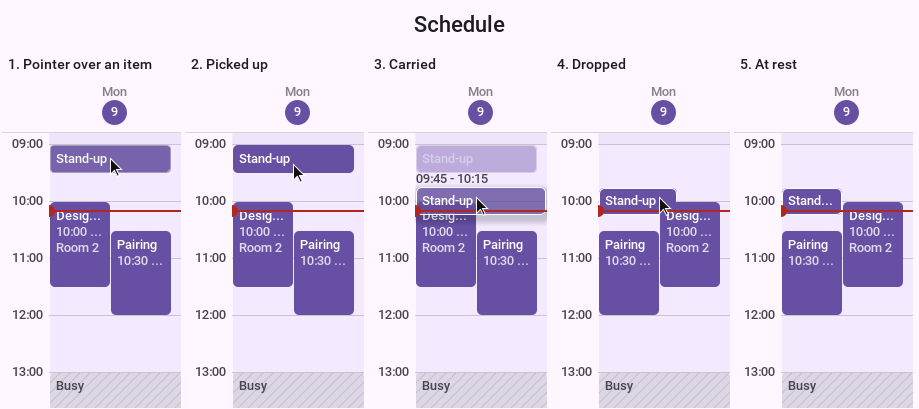
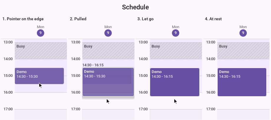
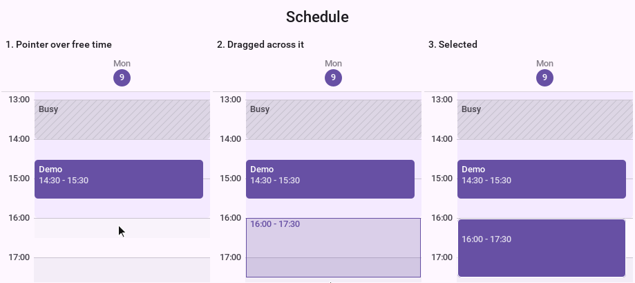
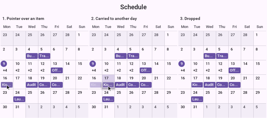
A mouse says a lot before it’s pressed, and the views answer it. The item under the pointer lights up, and over free time the slot a drag would start in is marked. The cursor says what a drag would do: an arrow cross over an item that can be moved, a resize arrow at an edge that can be pulled, a hand over something that can only be opened. A tooltip gives the title and the time of an item too small to show them. None of this appears on a touch screen, which has no pointer to rest.
Edits are animated the same way with a mouse and with a finger. An item that’s picked up lifts off the page: a shadow comes up under it, and the place it left dims to show where it’d return. Let go, it glides from where it was dropped to the time it snapped to, and takes its place beside whatever is already there. An edit a listener refuses glides back to where it started. Each of these takes under a quarter of a second.
The figures that follow are those animations stopped at their stages.
An application that takes screenshots of its own, or tests an animation, stops
the clock they run by. setAnimationTime fixes it at a number of milliseconds,
whatever starts afterward starts at that moment, and moving the clock on shows
the animation that far along. It’s how the figures above were made.
// Stop the clock, do what starts the animation, then move the clock
// to the moment wanted: 80 milliseconds into picking an item up.
scheduler.setAnimationTime(1000);
drag.run();
scheduler.setAnimationTime(1080);

Image frame = Image.createImage(scheduler.getWidth(), scheduler.getHeight());
scheduler.paintComponent(frame.getGraphics(), true);

// Back to the real clock.
scheduler.setAnimationTime(-1);
Showing a calendar
CalendarScheduleModel is a ScheduleModel over a CalendarSource from the
calendar API: the device’s calendars, Google,
Microsoft or CalDAV. Each calendar added is a resource, recurring events are
expanded for the range in view, and a drag saves the event back through the
source.
LocalCalendarSource source = LocalCalendarSource.getInstance();
CalendarScheduleModel model = new CalendarScheduleModel(source, ZoneId.systemDefault());
source.listCalendars(CalendarInfo.ContentType.EVENTS, null).ready(page -> {
    for (CalendarInfo calendar : page.getItems()) {
        model.addCalendar(calendar);
    }
});

Scheduler scheduler = new Scheduler(model);
Form form = new Form("My calendars", new BorderLayout());
form.add(BorderLayout.CENTER, scheduler);
form.show();
addFreeBusyCalendar adds a calendar as blocked time only, for a person whose
details aren’t the user’s to read. setMutationScope decides whether a drag on
one occurrence of a recurring event changes that occurrence or the series.
Call dispose() when the form is gone, so the model stops listening to the
source.
A project as a Gantt chart
A ProjectModel holds tasks in a tree, the dependencies between them, the
resources they’re assigned to and the calendar they’re worked on. A task has a
duration in working time and no dates of its own: update() schedules the
project, and each task then answers getStart() and getEnd().
long day = TimeMath.DAY;
WorkCalendar calendar = new WorkCalendar(ZoneId.systemDefault());
ProjectModel project = new ProjectModel(calendar,
        TimeMath.startOfDay(System.currentTimeMillis(), calendar.getZone()));
project.addResource(new ScheduleResource("dev", "Developer"));
project.addResource(new ScheduleResource("qa", "Tester"));

// A duration is working time: three days of the calendar's hours.
long workDay = calendar.getMillisPerDay();
GanttTask build = new GanttTask("build", "Build");
GanttTask api = new GanttTask("api", "API", 3 * workDay).assign("dev");
GanttTask screens = new GanttTask("screens", "Screens", 5 * workDay).assign("dev");
GanttTask testing = new GanttTask("test", "Testing", 2 * workDay).assign("qa");
GanttTask release = new GanttTask("release", "Release", 0);

project.addTask(build);
project.addTask(build, api);
project.addTask(build, screens);
project.addTask(testing);
project.addTask(release);

project.link(api, screens);
project.link(screens, testing);
// The release follows testing by a day.
project.link(testing, release, TaskDependency.Type.FINISH_TO_START, day);
project.update();

Gantt gantt = new Gantt(project);
gantt.setShowCriticalPath(true);

Form form = new Form("Plan", new BorderLayout());
form.add(BorderLayout.CENTER, gantt);
form.show();
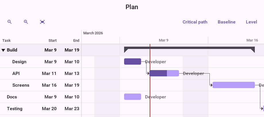
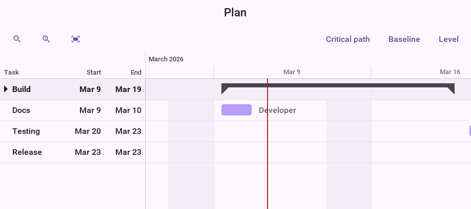
A task with children is a summary, drawn as a bracket over them, and a task with no duration is a milestone. A dependency is one of the four usual types, with a lag that may be negative:
| Type | The successor |
|---|---|
| Starts when the predecessor finishes. This is what |
| Starts when the predecessor starts. |
| Finishes when the predecessor finishes. |
| Finishes when the predecessor starts. |
A link that would close a loop is refused: canLink answers before one is
made, and link throws when it’s asked for one anyway.
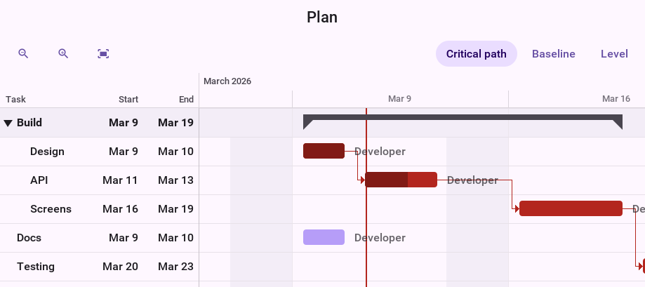
Scheduling runs a forward and a backward pass over working time. Afterward
every task has its early and late dates, getTotalSlack() says how long it can
slip before the project does, and isCritical() marks the tasks with none.
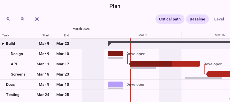
setShowCriticalPath(true) draws those bars and the links between them in
their own colors.
captureBaseline() keeps every task’s dates as the plan of record, and
setShowBaseline(true) draws them as a thin bar under each task, so a slip
shows as a bar that has moved off its baseline. setCollapsed folds a summary
over its tasks, as a tap on its arrow in the table does.
A task can be held by a constraint, such as START_NO_EARLIER_THAN a date or
MUST_FINISH_ON one, and isConstraintViolated() reports one the links made
impossible. setManuallyScheduled(true) takes a task out of scheduling
altogether and keeps the dates it’s given.
In the chart, a drag moves a bar, a drag on its end changes the duration, the
handle inside it sets the progress, and a drag from a bar’s end to another bar
links the two. Every edit goes through the model and the project is scheduled
again. A GanttListener can refuse any of them:
ProjectModel project = new ProjectModel(new WorkCalendar(), System.currentTimeMillis());
Gantt gantt = new Gantt(project);
gantt.addGanttListener(new GanttAdapter() {
    @Override
    public boolean taskChanging(Gantt g, GanttTask task, long start, long end) {
        // A task that is finished stays where it is.
        return task.getPercentComplete() < 100;
    }

    @Override
    public boolean linkCreating(Gantt g, GanttTask predecessor, GanttTask successor) {
        return !successor.isSummary();
    }
});

// What the plan was, drawn as a ghost bar under what it becomes.
project.captureBaseline();
gantt.setShowBaseline(true);
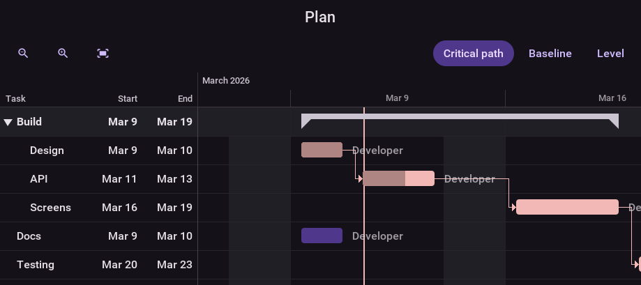
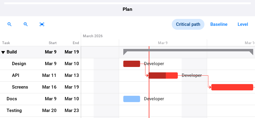
The chart answers a mouse as the scheduler does. The bar under the pointer lights up together with the links into and out of it, and its row is marked in the table and across the chart, so a task is easy to follow in a wide plan. The cursor shows what a drag would do, down to the end of a bar and the two handles of the selected one, and a tooltip gives the task’s dates and progress. A bar that’s picked up lifts over a shadow, and when it’s let go the project is scheduled again and every bar the change moved slides to its new dates together.
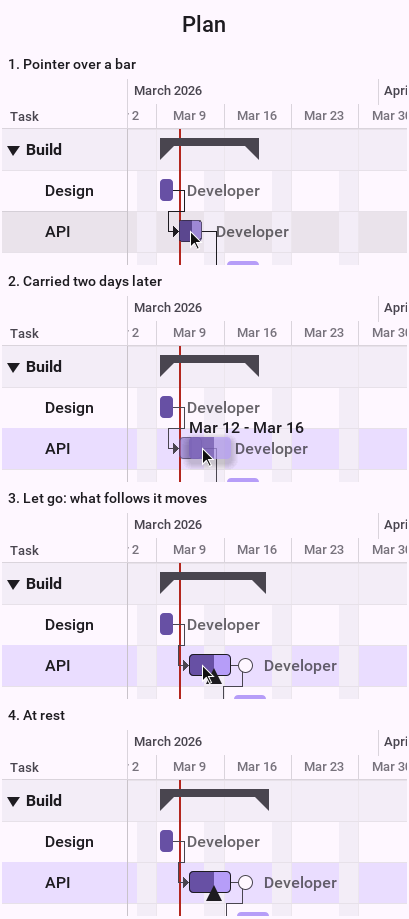
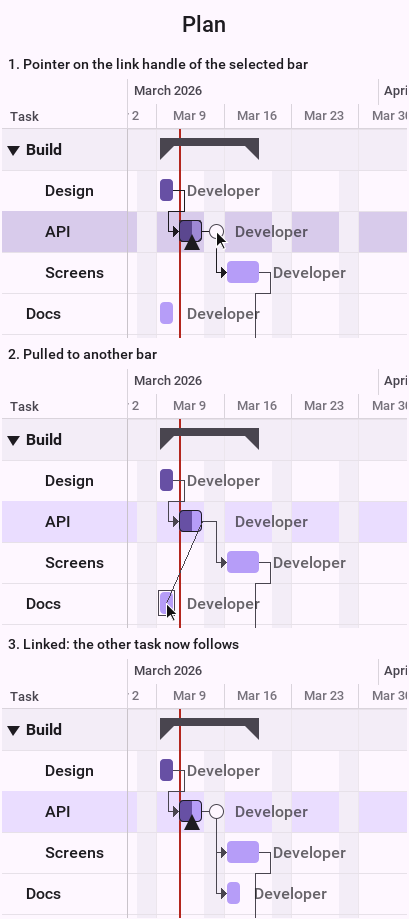
Gantt has the same setAnimationTime as Scheduler, which is how these
frames were stopped.
Resource load and leveling
A task is assigned to a resource in units: assign("dev") is one person
full-time, assign("dev", 0.5f) half of one. A resource has a capacity, and where
the tasks assigned to it add up to more, it’s over-allocated.
setLoadVisible(true) puts a histogram of each resource’s load under the
chart, on the same time axis, with the stretches over capacity in the error
color.
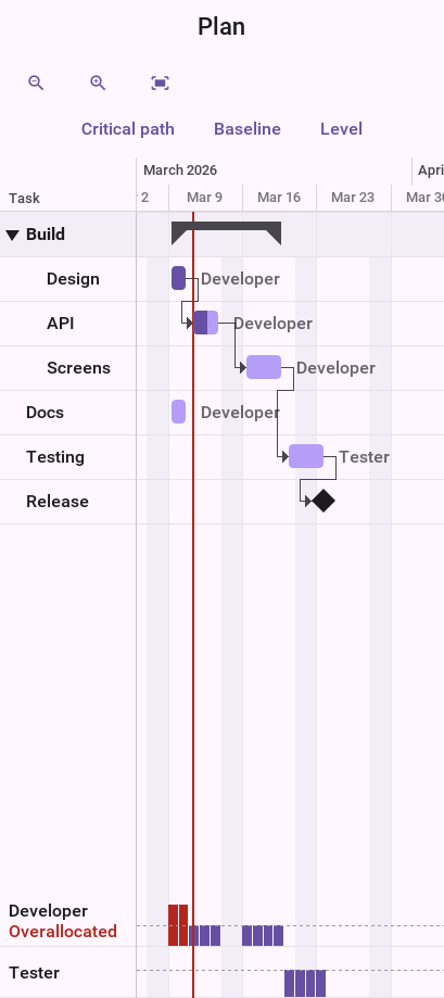
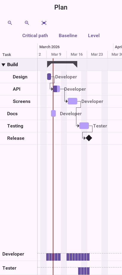
ResourceLeveler resolves over-allocation by delaying tasks. It first uses the
slack a task has, so the project’s end doesn’t move, and then delays by
priority. It returns a proposal and changes nothing until that’s applied:
WorkCalendar calendar = new WorkCalendar();
ProjectModel project = new ProjectModel(calendar, System.currentTimeMillis());
project.addResource(new ScheduleResource("dev", "Developer"));
// Two tasks at once for somebody there is one of.
project.addTask(new GanttTask("api", "API", 3 * calendar.getMillisPerDay()).assign("dev"));
project.addTask(new GanttTask("screens", "Screens", 2 * calendar.getMillisPerDay()).assign("dev"));
project.update();

if (!ResourceLeveler.findOverallocations(project).isEmpty()) {
    LevelingResult proposal = ResourceLeveler.level(project);
    long slip = proposal.getFinishAfter() - proposal.getFinishBefore();
    if (proposal.isChanged() && Dialog.show("Level resources",
            proposal.getChangedTasks().size() + " tasks move; the project ends "
                    + slip / TimeMath.DAY + " days later.", "Apply", "Cancel")) {
        proposal.apply();
    }
}
getUnresolved() lists what leveling couldn’t fix, such as one task that needs
more of a resource than there is. ProjectModel.clearLeveling() removes the
delays again.
Printing and export
SchedulePrinter renders a scheduler or a Gantt chart on pages: the whole
view at the zoom it has, split across and down, with the hour column, the
resource names or the task table repeated on every page.
Scheduler scheduler = new Scheduler();
SchedulePrinter printer = new SchedulePrinter(scheduler);
printer.setTitle("Week 12");

// One picture of all of it, to share.
Image picture = printer.renderImage(2000);

// Or page by page.
for (int page = 0; page < printer.getPageCount(); page++) {
    Image sheet = printer.renderPage(page);
}

// Or to the platform's print dialog.
printer.print(new PrintResultListener() {
    @Override
    public void onResult(PrintResult result) {
        if (result.isFailed()) {
            Dialog.show("Print", result.getError(), "OK", null);
        }
    }
});
writePdf writes the same pages to a PDF file where the platform can encode a
JPEG, which SchedulePrinter.isPdfSupported() reports. The pages are pictures,
so their text can’t be selected. print needs a platform that prints, as
Printer.isPrintingSupported() says.
Styling
The components paint from styles, so a theme restyles them like anything else. The native themes define every one of these UIIDs; with another theme they fall back to a neutral light or dark palette, and a UIID the theme does define is taken from the theme whole.
| UIID | What takes its colors and font from it |
|---|---|
| The background and the toolbar |
| Grid lines, the time outside working hours, the current time and a selected range |
| Day and resource titles, today’s title, and the hours |
| Items, by kind |
| The month grid and the agenda |
| The chart, its time axis and the task table |
| Bars |
| Dependency lines |
| The resource load histogram |
An item, a resource or a task can carry a color or a UIID of its own
(setColor, setUIID), which is how one schedule shows confirmed and
tentative bookings differently. For anything further, setItemRenderer and
setBarRenderer replace the painting of an item or a bar; extend
DefaultScheduleItemRenderer or DefaultGanttBarRenderer to change one part
of it.
Restyling from CSS
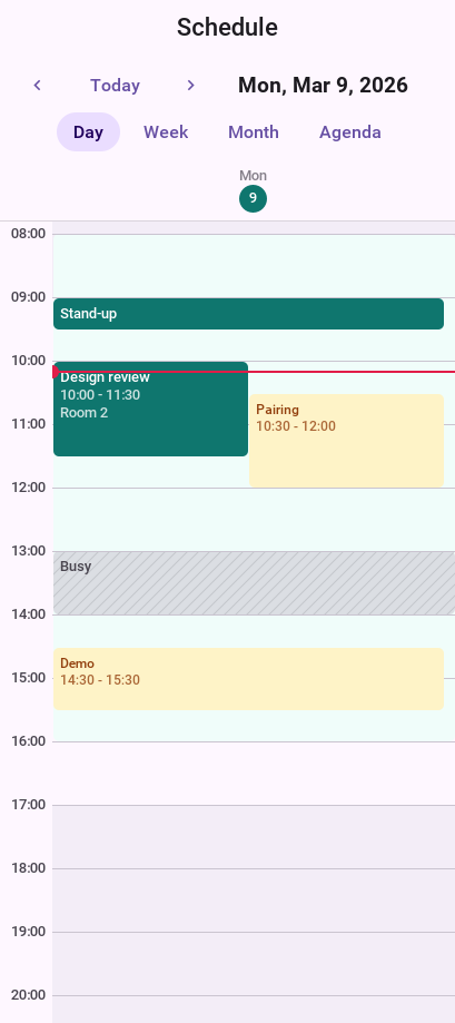
A rule for one of the UIIDs in the table changes that part and leaves the rest to the native theme. These rules give the schedule a brand color, and add a UIID of the application’s own for bookings that aren’t confirmed:
SchedulerItem {
    background-color: #0f766e;
    color: #ffffff;
}

SchedulerBackgroundItem {
    background-color: #f0fdfa;
    color: #115e59;
}

SchedulerHeaderToday {
    background-color: #0f766e;
    color: #ffffff;
}

SchedulerNow {
    background-color: #e11d48;
    color: #e11d48;
}

/* A UIID of the application's own, for the items that ask for it. */
TentativeBooking {
    background-color: #fef3c7;
    color: #92400e;
    font-family: "native:MainRegular";
    font-size: 1.4mm;
}
The items that are tentative ask for that UIID with
item.setUIID("TentativeBooking").
The Gantt chart is restyled the same way:
GanttBar {
    background-color: #93c5fd;
    color: #0f172a;
}

GanttBarProgress {
    background-color: #1d4ed8;
    color: #ffffff;
}

GanttBarCritical {
    background-color: #f97316;
    color: #0f172a;
}

GanttSummaryBar {
    background-color: #0f172a;
    color: #ffffff;
}

GanttMilestone {
    background-color: #7c3aed;
    color: #ffffff;
}

GanttLinkCritical {
    color: #f97316;
}
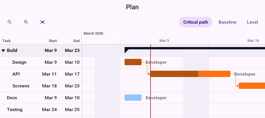
The chart follows the theme’s appearance and platform like the scheduler:
Colors from the data
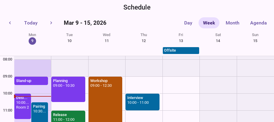
A color can come from the model instead of the theme. A resource with a color gives it to all its items, and an item with one of its own overrides that; the text turns black or white to stay readable on whichever it is.
A renderer of your own
A renderer is handed the item, its rectangle and a set of flags that say how
it’s being shown: SELECTED, DRAGGED while it’s carried, HOVERED while
the pointer rests on it, COMPACT in the month and the all-day lane. This one
draws an event as a card with a stripe, and deepens it under the pointer:
/// Draws an event as a card: a pale body with a stripe in the item's
/// colour, which deepens under the pointer and when it is selected.
public class CardItemRenderer extends DefaultScheduleItemRenderer {
    @Override
    public void paintItem(Graphics g, Scheduler scheduler, ScheduleItem item,
            int x, int y, int width, int height, int state) {
        if (item.getKind() != ScheduleItem.Kind.EVENT) {
            // Working time and blocked time keep the theme's look.
            super.paintItem(g, scheduler, item, x, y, width, height, state);
            return;
        }
        int color = item.getColor() >= 0 ? item.getColor() : 0x0f766e;
        boolean lit = (state & (HOVERED | SELECTED | DRAGGED)) != 0;
        int alpha = g.getAlpha();
        g.setColor(0xffffff);
        g.fillRect(x, y, width, height);
        g.setColor(color);
        g.setAlpha(alpha * (lit ? 90 : 45) / 255);
        g.fillRect(x, y, width, height);
        g.setAlpha(alpha);
        int stripe = Math.min(width, 4);
        g.fillRect(x, y, stripe, height);
        paintText(g, scheduler, item,
                UIManager.getInstance().getComponentStyle("SchedulerItem").getFont(),
                0x1d1b20, x + stripe, y, width - stripe, height, state);
    }
}
scheduler.setItemRenderer(new CardItemRenderer());
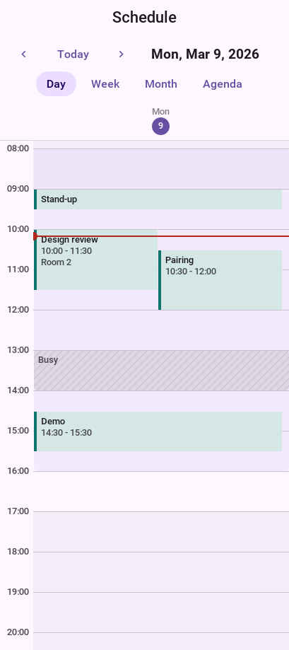
The views still draw the light, the shadow and the glide around what the renderer paints, so a custom item moves like a built-in one.